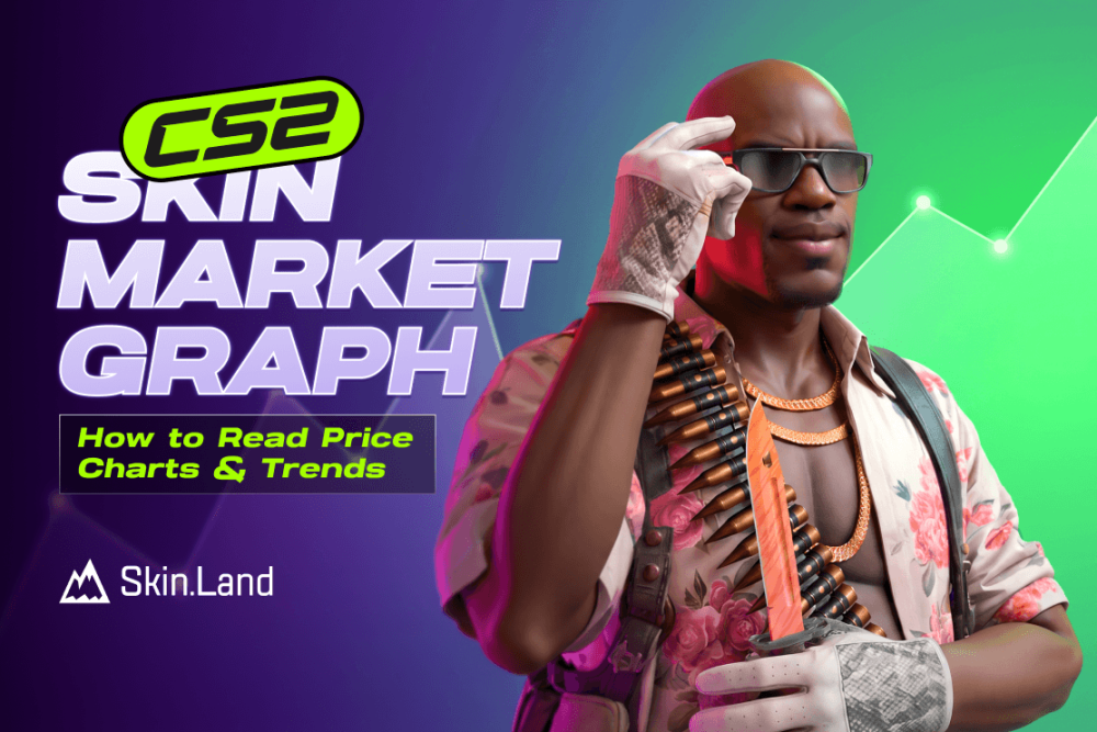

A CS2 skin's market graph is a median-sale-price line paired with volume bars over time, not a single "current price" — it shows what an item actually sold for in each window, not what sellers are currently asking. This guide breaks down every part of that chart, why the line oscillates daily, and where it can genuinely mislead you. 

What the Market Graph Actually Shows

The green line on a Steam Community Market item page plots the median sale price for each time window — the middle value of what actually sold, not an average and not the lowest listed price you'd pay to buy right now. For roughly the last 30 days, each point covers an hour of sales; older data collapses into daily windows. The bars underneath are volume: how many copies actually changed hands in that window, which matters just as much as the price line itself. 

That distinction trips a lot of buyers up. A median price of $30 doesn't mean you can buy one for $30 right now — it means that's what half the recent sales landed above or below. The actual buy price is whatever the cheapest live listing costs, which can sit well above (or occasionally below) the median depending on how many sellers are currently undercutting each other. 

Why CS2 Skin Prices Oscillate Every Day

Steam Market prices genuinely swing in a repeating daily pattern, and it isn't random. Different regions play, sell, and buy at different rates depending on their local time of day — cases and drops handed out during someone's peak play hours often get dumped onto the market for quick cash rather than held. The Steam Community Market's 15% cut (5% Steam plus 10% to the game) is exactly why that oscillation never gets arbitraged away: a trader would need a swing bigger than 15% to profit from buying low and reselling high, and the actual daily wobble is almost always smaller than that. Knowing this matters more than watching any single data point — a dip at a specific hour usually reverses within a day and isn't a trend on its own. 

Reading the Volume Bars, Not Just the Price Line

A price drop paired with a volume spike usually means a supply flood, not a lasting crash — a new case, an operation, or a major update dumping fresh copies of related skins onto the market. A price drop with flat or low volume is a weaker, thinner move that's easier to reverse. For a broader look at how a supply shock has hit prices industry-wide before, see our CS2 skin market crash breakdown

Zooming Out: Pick the Right Time Frame Before You Judge a Trend

Most market graphs let you switch between a short window (the last few days or weeks) and a longer one (several months to a full year or more), and the two views can tell completely different stories about the same skin. A 7-day window packed with the daily oscillation described above can look like a downtrend purely by coincidence of which hours it starts and ends on, while the same skin's 6-month or all-time view might show a slow, steady climb with that noise barely visible. As a rule, treat anything inside a single week as noise until you've confirmed the same direction holds on a 90-day view — a real trend should still be visible once you zoom out far enough to average out the daily wobble. 

Common Mistakes When Reading a CS2 Price Graph

A few habits account for most of the bad calls people make off a price chart: 

  • Reacting to a single hour's dip. One low-volume hour can pull the line down without meaning anything — check whether the next few hours confirm it before treating it as a signal.

  • Ignoring the 15% fee when planning a flip. A skin needs to move well past that threshold before buying low and reselling high actually turns a profit; a 5% bounce on the graph isn't a trade opportunity, it's just the fee eating any gain.

  • Comparing a StatTrak graph to its non-StatTrak twin. They're priced, and charted, as entirely separate items — a spike on one tells you nothing about the other.

  • Assuming a dip after a new case means the game's economy is shrinking. New cases and operations regularly pull spending and attention toward fresh skins, cooling demand for older ones for a while — our Kilowatt Case guide is a good example of the kind of release that tends to do this. That's a rotation effect, not proof the older skin lost real collector value.

  • Chasing a spike right after a Major or sticker capsule drop. Tournament-tied items often jump right when a capsule releases, then Valve typically discounts leftover stock afterward, flooding the market and pulling prices back down before scarcity slowly rebuilds them — buying at the initial spike is usually the worst time to get in.

Steam's Graph vs. Third-Party Trackers

Steam's own chart only reflects Steam Community Market sales — it says nothing about prices on Skin.Land or any other third-party marketplace, and it doesn't split results by float value or pattern. Third-party trackers pull from more markets at once and often let you filter by exterior or StatTrak, which gives a fuller liquidity picture than Steam's chart alone. Either way, the graph is a starting point for research, not a replacement for checking what to look at when buying CS2 skins before you commit to a purchase. 

What the Graph Can't Tell You

The median line flattens away float value entirely — two copies of the same skin and wear tier can be worth very different amounts depending on pattern and float, something a single price line can't show. Our guide to how skin wear affects appearance and skin wear explainer cover why that gap exists. StatTrak and non-StatTrak copies also track as entirely separate items with their own separate graphs, so make sure you're reading the chart for the exact variant you actually want. 

Example: Three Graphs, Three Liquidity Levels

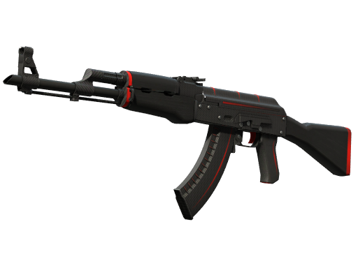
AK-47 | Redline - buy on Skin.Land

The AK-47 | Redline is one of the most heavily traded rifle skins in the game — Skin.Land alone currently carries close to 1,400 Field-Tested listings, so its graph tends to show a smooth, tightly banded line with steady volume day to day. 

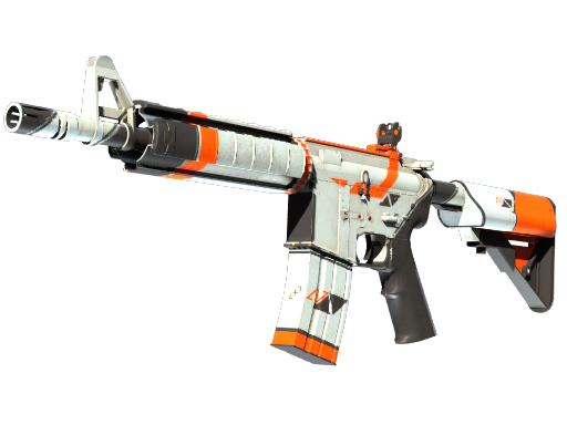
M4A4 | Asiimov - buy on Skin.Land

The M4A4 | Asiimov sits in the middle — Skin.Land carries around 140 Field-Tested listings, enough to keep its graph readable but with noticeably more visible steps between price points than the Redline's near-continuous line. 

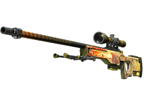
AWP | Dragon Lore - buy on Skin.Land

The AWP | Dragon Lore sits at the far end — with only a handful of Factory New copies listed anywhere at once, each individual sale can swing the median noticeably, so its graph naturally looks sparse and jumpy compared to the other two. That kind of scarcity is exactly what our rare CS2 skins guide digs into in more depth. 

That's a liquidity difference, not necessarily a sign any of the three is more or less stable in real value; our CS2 skins to invest in guide covers how liquidity factors into that kind of buying decision. 

Buy CS2 skins on Skin.Land

FAQ

What does the line on a CS2 skin's market graph actually mean?

It's the median sale price for each time window — the middle of what items actually sold for, not an average, and not the price you'd currently pay to buy one.

Why do CS2 skin prices go up and down every day?

Different regions play, sell, and buy at different times, and the Steam Community Market's 15% transaction fee is large enough that traders can't profitably flatten out the resulting daily swings, so the oscillation just repeats.

Does a price drop on the graph always mean a skin is losing value?

Not on its own — check the volume bars first. A drop paired with a volume spike often just reflects a fresh supply of the skin hitting the market (a new case or update), rather than a lasting decline.

Why does a rare skin's graph look so much choppier than a common one's?

Low-volume items have far fewer sales to average, so each individual trade moves the median more. A skin like AWP | Dragon Lore, with only a handful of Factory New copies in circulation, will always look more volatile on a chart than a heavily traded skin like AK-47 | Redline, purely because of how few data points feed it.

Can the market graph tell me if a specific skin's float or pattern is a good deal?

No. The graph tracks the whole listing pool for a given wear tier, and float value or pattern-specific pricing sits underneath that median — two copies of the same line item can be priced very differently once you factor those in.

Should I trust a 7-day chart or a longer one?

Lean on the longer view. A 7-day window is short enough that the normal daily oscillation can make a skin look like it's trending up or down purely by chance — a real trend should still show up once you check a 90-day or all-time view and the noise averages out.

Why do sticker and capsule graphs spike right after a Major, then crash?

Tournament-tied stickers and capsules often jump the moment they release, but Valve typically discounts leftover stock once the event ends, flooding the market with cheap copies and pulling the price back down before scarcity gradually rebuilds it. That makes the initial post-release spike one of the worst times to buy in, not the best. For a broader view of how buying-versus-holding decisions like this play out, see our trading vs. investing guide.

0 评论

写评论

我们的其他精彩文章